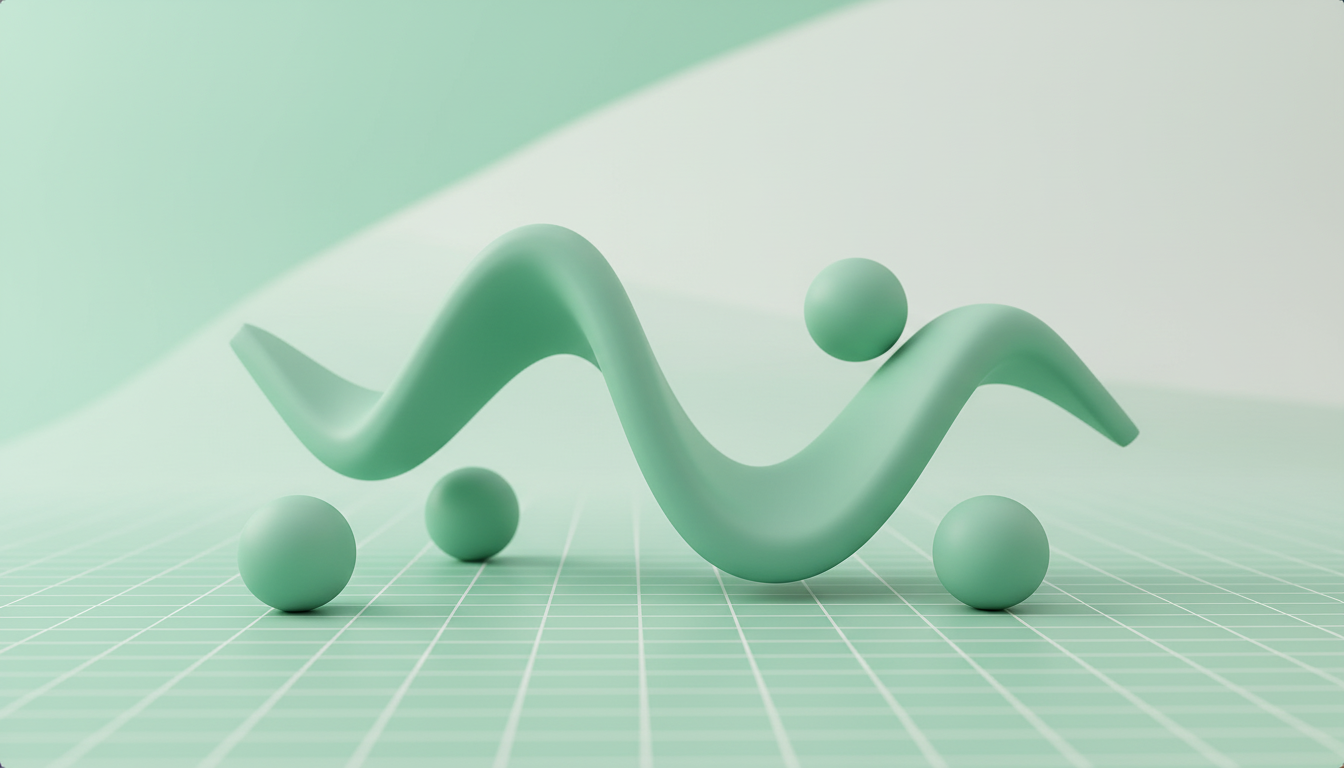
The Motion Renaissance on the Web: Micro-Interactions That Don’t Tank Performance
Web motion is back—but the best work isn’t louder, it’s smarter. Here’s how to design micro-interactions that improve comprehension, stay compositor-friendly, respect reduced-motion preferences, and fit inside a practical per-page motion budget.
Motion is trending again—but not because we suddenly forgot how to build fast websites.
It’s trending because motion is one of the few UI tools that can increase clarity without adding more UI. A 120ms transition can explain hierarchy, confirm intent, and guide attention in a way that a paragraph of helper text never will.
The catch: motion is also one of the easiest ways to accidentally ship a site that feels sluggish, janky, or inaccessible.
This is a modern, studio-friendly guide to expressive UI motion with the smallest possible animation surface area—so you can ship pages that feel premium and stay fast.
Why motion is trending again (and why the best motion is almost invisible)
We’re in a “motion renaissance” for a few reasons:
- Design systems matured. Teams have consistent components, so motion can be applied systematically (not as one-off flair).
- Better tooling. DevTools performance panels,
prefers-reduced-motion, and modern animation libraries make it easier to do this responsibly. - Higher expectations. Users now compare your product to the smoothness of Apple, Stripe, Linear, and the best editorial sites—not just your competitors.
But the real reason motion wins is that it improves comprehension when it answers one of these questions:
- What just happened? (feedback)
- Where did that come from / go to? (continuity)
- What can I do next? (affordance)
If an animation can’t be mapped to one of those, it’s usually decoration—and decoration is where performance and accessibility debt tends to hide.
Rule of thumb: If motion doesn’t reduce cognitive load, it’s not “delight.” It’s noise.
Takeaway: Treat motion like typography. Good typography isn’t noticed; it’s felt. Great motion works the same way.
The micro-interaction toolkit (small surface area, big UX wins)
Micro-interactions are where you get the highest ROI: minimal pixels moving, maximal clarity gained. Here are the patterns that consistently pay off.
1) Hover: affordance without theatrics
Hover motion should answer: “Is this interactive?” and “What’s the primary action?”
What works well
- Subtle elevation via
transform: translateY()(nottop) - Shadow changes (careful: large blurred shadows can be expensive)
- Underline animations for links (especially in editorial or marketing pages)
Example pattern
- Buttons: 80–140ms ease-out on hover
- Cards: 120–180ms ease-out with a 2–4px translate
Avoid
- Hover effects that rearrange layout (layout shift breaks the “stable UI” contract)
- Over-animating everything in a grid (50 cards animating on mousemove is a GPU party you didn’t plan)
Takeaway: Hover motion should be predictable and repeatable—users will trigger it constantly.
2) Focus: keyboard clarity that feels first-class
Focus states are motion’s underrated superpower, because they serve both accessibility and polish.
What works well
- A focus ring that fades/animates in (not a sudden flash)
- A small scale or glow change on focused inputs
Key detail: Don’t animate focus in a way that delays visibility. Focus must be immediately perceivable.
Takeaway: Motion on focus should reinforce the focus indicator, not replace it.
3) Press / tap: immediate feedback (especially on mobile)
Press states should feel tactile.
What works well
transform: scale(0.98)on press (fast: 60–100ms)- A quick highlight ripple (only if you can do it cheaply)
Avoid
- Long press animations that make the UI feel laggy
Takeaway: Press feedback is about latency masking—make the interface feel instantaneous.
4) Transitions: continuity between UI states
State changes are where users get confused. Motion can narrate the change.
High-value transitions
- Accordion expand/collapse (with care—height animations can be tricky)
- Tabs switching (fade + slight translate)
- Modals/drawers (opacity + translate)
A practical approach for accordions
Instead of animating height: auto directly, consider:
- Using CSS grid trick (
grid-template-rows) for smoother behavior, or - Measuring height in JS once, then animating to a pixel value
Takeaway: Transitions should preserve the user’s mental model: “this became that.”
5) Scroll: use it sparingly, make it meaningful
Scroll-linked motion is the most seductive and the most dangerous.
What’s worth doing
- Subtle parallax on a single hero element
- Section reveals that confirm progress (not distract)
- Sticky headers that reduce as you scroll (saving space)
What often backfires
- Animating every element on scroll
- Heavy blur + large-scale transforms
- Scroll hijacking (custom scroll) unless you have a very strong reason
Takeaway: Scroll motion should be a highlight, not the baseline.
Performance guardrails for creative effects (what stays smooth, what gets janky)
Performance isn’t about “no motion.” It’s about choosing motion the browser can render efficiently.
The golden rule: animate the compositor-friendly properties
In most cases, the safest properties to animate are:
transformopacity
These can often be handled on the compositor thread, reducing layout and paint work.
Common compositor-friendly patterns
- Translate/scale for movement
- Crossfade for content swaps
- Mask-like effects using transforms (instead of animating clip paths everywhere)
If you only remember one thing: Prefer
transform+opacityfor 80% of your motion.
Know what triggers layout and paint
These are common performance traps:
- Layout triggers:
width,height,top,left,margin,padding,font-size - Paint-heavy effects: big
box-shadow, largefilter: blur(), complexbackdrop-filter, frequentclip-pathchanges
Sometimes you can still use them—but you need to treat them like expensive ingredients.
When heavy effects are justified (and how to contain them)
If you’re building a premium brand moment (think: a product launch page, a campaign microsite), you might choose heavier effects intentionally.
Contain them with these tactics:
- Limit the blast radius: animate one hero element, not 30 cards
- Short durations: keep heavy effects under ~300ms unless it’s a deliberate cinematic moment
- Isolate layers carefully:
will-changecan help, but overusing it can increase memory and hurt performance - Test on real devices: your M3 MacBook is not your user’s mid-range Android
Real-world reference: Sites featured on Awwwards often succeed when they use a single “signature” motion motif and keep the rest of the UI calm. The contrast makes the hero feel special without taxing the whole page.
Quick rules of thumb your studio can standardize
- Default durations: 120–200ms for UI, 200–400ms for page-level transitions
- Easing: use ease-out for entrances, ease-in for exits, and avoid springy easing unless it communicates physics
- Staggering: stagger lists only when it adds comprehension (e.g., onboarding steps), not as a default
- Avoid infinite loops: if it loops, it should be subtle and optional
Takeaway: Your goal is not “maximum motion.” It’s maximum perceived quality per millisecond of work.
Accessibility and inclusive motion defaults (without killing the vibe)
Motion can cause discomfort, distraction, or nausea for some users. Inclusive motion isn’t a constraint—it’s a mark of craft.
Honor prefers-reduced-motion by design, not as an afterthought
Use prefers-reduced-motion to reduce or remove non-essential motion.
What to reduce
- Parallax
- Large-scale movement across the viewport
- Scroll-linked animations
- Complex easing/spring effects
What to keep (often helpful)
- Instant state changes (no animation)
- Small opacity fades for continuity
- Focus indicators (must remain clear)
A practical CSS approach
- Define motion tokens with CSS variables
- In reduced-motion mode, set durations to near-zero and remove transforms
This keeps your codebase clean and prevents “forgotten” animations.
Provide UX alternatives when motion is removed
If motion communicates meaning, you need a non-motion equivalent.
Examples:
- Instead of a sliding drawer: instant open + strong visual hierarchy (overlay, clear title, close button)
- Instead of animated progress: explicit step labels and a visible progress indicator
- Instead of scroll reveals: static layout with spacing and typography doing the work
Accessibility isn’t just disabling motion. It’s ensuring the UI still communicates the same story.
Avoid “motion as the only signal”
Never rely on animation alone to communicate:
- Errors (also show text + icon)
- Success (also show confirmation copy)
- Selected state (also show styling)
Takeaway: Reduced motion should feel like a different mode, not a broken version.
A reusable motion budget framework (so you can ship consistently)
Studios struggle with motion because it’s often negotiated component by component. A motion budget makes motion a product decision, not a series of exceptions.
Here’s a practical framework you can apply per page.
Step 1: Define your motion tiers
Tier 0 — Essential UI feedback (always allowed)
- Button hover/press
- Focus states
- Form validation feedback
Tier 1 — Comprehension enhancers (allowed by default)
- Modal/drawer transitions (opacity/transform)
- Tab/accordion transitions (careful implementation)
- Toast notifications
Tier 2 — Signature moments (limited)
- One hero animation
- One scroll-linked sequence OR one parallax motif
- A single “brand flourish” (e.g., logo animation)
Tier 3 — Experimental / cinematic (requires explicit approval)
- WebGL/canvas-heavy scenes
- Multiple simultaneous scroll timelines
- Heavy filter-based effects across large areas
Takeaway: Most pages should live in Tier 0–1, with a single Tier 2 moment.
Step 2: Cap the number of concurrent animations
A simple cap prevents accidental overload:
- Max 3 concurrent animations in the viewport for standard pages
- Max 1 scroll-linked animation per page section
- Max 1 “heavy” effect (blur/backdrop-filter/complex mask) per page
Step 3: Establish “motion tokens” like a design system
Define shared values:
- Durations:
--motion-fast,--motion-base,--motion-slow - Easings:
--ease-out,--ease-in-out,--ease-emphasized - Distances:
--motion-distance-sm,--motion-distance-md
This makes motion feel cohesive—like it belongs to the brand.
Step 4: Add performance acceptance criteria
Make it measurable. Examples:
- No long tasks introduced by animation triggers
- Smooth interaction on mid-tier mobile devices
- Avoid layout thrashing (especially in scroll handlers)
Tools you can reference in reviews:
- Chrome DevTools Performance panel
- Lighthouse (for regressions, not as the only truth)
- WebPageTest (realistic network + device simulation)
Example budgets (what this looks like in real projects)
Marketing landing page (B2B SaaS)
- Tier 0: button/focus/press
- Tier 1: modal transitions, accordion, subtle card hover
- Tier 2: one hero illustration with a short entrance sequence
- Reduced motion: hero becomes static, transitions become instant or fade-only
Portfolio / studio site
- Tier 0–1 across the system
- Tier 2: one scroll-linked typographic moment on the manifesto section
- Tier 3: reserved for a single case study page (if it’s worth it)
Takeaway: A motion budget gives you permission to be expressive—without letting motion sprawl.
How to sell motion to clients (without overselling)
Clients don’t buy “animations.” They buy outcomes: clarity, conversion, brand perception.
Position motion as a usability upgrade
Use language like:
- “We’ll use micro-interactions to reduce ambiguity and improve task completion.”
- “Motion will create continuity between states so users don’t feel lost.”
- “We’ll add a single signature moment to reinforce brand premium without slowing the page.”
Show a small prototype, not a big promise
A 10–20 second prototype (Figma Smart Animate, Framer, or a quick HTML/CSS demo) is more persuasive than a deck.
What to prototype:
- One button + one modal + one signature hero moment
This demonstrates taste and restraint.
Include accessibility and performance in the pitch
Make it part of the value:
- “We’ll support
prefers-reduced-motionso the experience is inclusive.” - “We’ll prioritize compositor-friendly properties to keep interactions smooth.”
The fastest way to build trust is to show you have a plan for the tradeoffs.
Offer motion as a scoped package
Instead of “we’ll animate the site,” sell a bounded deliverable:
- Motion language (tokens + guidelines)
- Core component micro-interactions (Tier 0–1)
- One signature moment (Tier 2)
- Reduced-motion mode
Takeaway: Restraint is a feature. Clients love motion more when you make it feel intentional.
Conclusion: make motion a system, not a stunt
The motion renaissance isn’t about turning every scroll into a fireworks show. It’s about using small, meaningful motion to make interfaces easier to understand—and more enjoyable to use.
If you want a practical north star:
- Use micro-interactions to clarify intent
- Animate mostly
transformandopacity - Treat heavy effects as rare, premium ingredients
- Ship inclusive defaults with
prefers-reduced-motion - Adopt a motion budget so the work stays coherent
Call to action
If your studio wants help defining a motion budget, building motion tokens into your design system, or prototyping a signature moment that stays fast on real devices, let’s talk. The goal isn’t “more animation.” It’s more meaning per pixel—with performance and accessibility baked in.