

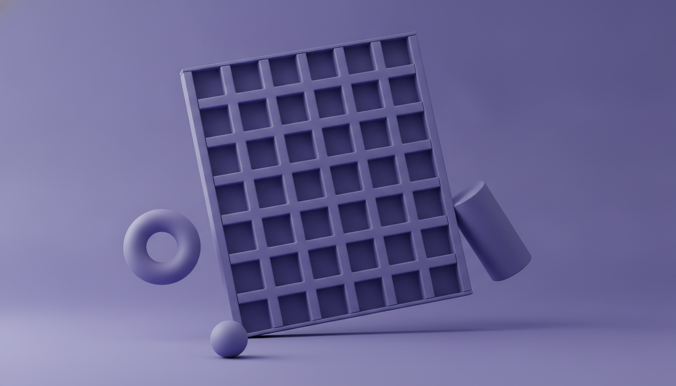
The New Editorial Web: How Print-Inspired Grid Systems Became the Agency Differentiator Nobody Saw Coming
While the industry races toward generative AI aesthetics and immersive 3D experiences, a quiet cohort of boutique agencies is winning the most discerning clients — and charging editorial-rate premiums — by doing something radical: looking backward at print.
The Print Revival: Why the Smartest Designers Are Looking Backward to Move Forward
Here's a provocation worth sitting with: the most forward-thinking web studios of the next five years won't be defined by what technology they use — they'll be defined by what they understand about the history of visual communication.
While the dominant conversation in digital design circles remains fixated on generative aesthetics, particle systems, and WebGL spectacle, something quieter and considerably more profitable is happening at the edges of the industry. A rising cohort of boutique agencies — many of them deliberately small — has begun importing the compositional intelligence of editorial print design into the browser, and clients with genuine taste are responding with larger budgets and longer retainers.
This isn't nostalgia. It's a strategic repositioning that exploits a real gap in the market: the gap between studios that can make something impressive and studios that can make something considered.
What Editorial Web Design Actually Means in Practice
Before we go further, let's be precise about terms — because "editorial" is already at risk of becoming a mood board buzzword stripped of its actual meaning.
Editorial web design is not about making websites look like magazines. It's about borrowing the structural intelligence that print designers developed over centuries of solving a genuinely hard problem: how do you create hierarchy, rhythm, and meaning on a flat, bounded surface using only typography, whitespace, and grid?
In practice, this means:
- Deliberate column structures that inform layout decisions at every breakpoint rather than defaulting to a 12-column Bootstrap grid because it's convenient
- Typographic scale systems where font size, weight, and leading do the heavy lifting that less disciplined designers hand off to illustration or animation
- Negative space treated as an active compositional element, not empty real estate waiting to be filled with a floating UI card
- Visual hierarchy that guides the eye through genuine structural logic — not just color contrast or hover states
Studios like Order (New York) and Linked by Air have built entire reputations on this kind of compositional rigor, producing work that reads as intelligent before a single word is processed. The portfolio of Anagrama out of Monterrey demonstrates similar principles applied across brand identity and digital surfaces simultaneously. These aren't studios doing retro pastiche — they're studios operating at a level of craft that trend-chasing simply cannot replicate.
Type as the Primary Design Element — Not the Afterthought
"Typography is what language looks like." — Ellen Lupton
If there's a single principle that separates editorial design from decorative design, it's the treatment of type. In most web projects — even well-budgeted ones — typography is selected late in the process, after layout, color, and interaction patterns have already calcified. It's a finishing material, like paint.
In editorial-led web design, type is the architecture.
The proliferation of variable fonts has made this shift genuinely viable at scale. Typefaces like Fraunces, Anybody, and Recursive expose axes — weight, width, slant, optical size — that allow a single typeface to carry an entire design system's expressive range without introducing the rendering inconsistency that used to plague multi-weight font stacks.
The business implication is significant: when a studio builds its design system around a sophisticated typographic hierarchy, it reduces dependence on visual gimmickry that is expensive to produce and expensive to maintain. A well-composed editorial layout built on a variable font system is:
- Faster to load — fewer font files, less render-blocking overhead
- Easier to maintain — type-driven systems have fewer bespoke components
- More accessible by default — semantic hierarchy and contrast ratios become natural outputs of the system, not afterthoughts
- More distinctive at a glance — because almost nobody is doing it well
For the senior designer thinking about how to defend a higher project rate, a robust type system is one of the most defensible deliverables in the proposal.
Building a Grid System That Scales Without Losing Its Soul
Here's where many studios falter when they attempt an editorial approach: the grid looks extraordinary at 1440px and completely loses its logic at 390px. The compositional tension that made the desktop layout compelling collapses into a single-column scroll that could have been built in an afternoon.
The solution isn't to build a separate mobile design — it's to design the grid system as a set of principles, not a fixed structure.
Editorial designers who've made this translation successfully tend to share a few habits:
- They define typographic anchors first — the type scale, line lengths, and leading ratios that will hold across all contexts — and let those constraints inform the column math
- They treat breakpoints as editorial decisions, not just technical thresholds. At what point does a two-column feature layout need to shift to a stacked treatment to preserve the reading experience? That's a typographic question, not a device-width question.
- They embrace asymmetry deliberately — offset grids, oversized folios, text that bleeds toward (but doesn't cross) an invisible margin — because asymmetry handled with discipline reads as confidence, while symmetry handled without intention reads as default
CSS Grid and Container Queries have finally given developers the vocabulary to implement these ideas without hacky workarounds. Studios that understand both the editorial theory and the modern CSS implementation are genuinely rare — and that rarity is a pricing lever.
Why Clients With Taste Pay a Premium for Editorial Direction
Let's talk about the commercial reality, because craft without a business model is just an expensive hobby.
Which verticals are actively seeking editorial web design — and why do they pay more for it?
- Luxury and heritage brands — Companies like Monocle, Aesop, or Any independent fashion house with archival depth understand that visual restraint is a signal of confidence. They've been burned by agencies that made them look trendy for eighteen months and dated for the next three years.
- Cultural institutions — Museums, foundations, and arts organizations are under pressure to feel both authoritative and accessible. Editorial grid systems accomplish this better than any other design approach currently available.
- Premium publishing and media — The newsletter economy has created a generation of independent media brands that take their visual identity seriously and understand that type and layout are part of their editorial voice, not an afterthought.
- Professional services firms — Boutique law firms, architecture practices, and high-end consultancies increasingly recognize that their website's visual grammar is a direct proxy for how potential clients assess their judgment.
The common thread: these clients have seen enough trend-chasing to be suspicious of it. When an agency presents an editorial-led concept, it signals something that a Lottie animation cannot — that the studio has a point of view rooted in the history and theory of visual communication, not just facility with the current toolset.
That signal is worth real money. Studios that have built explicit editorial positioning report project rates that run 30–60% above comparable studios competing on execution alone.
How to Position This Without Being Pigeonholed as "The Magazine Site Studio"
The positioning risk is real: lean too hard into editorial language and potential clients in SaaS, fintech, or e-commerce assume you can't build product interfaces or conversion-oriented experiences.
The reframe that works: position editorial design as a methodology, not a category.
You're not a studio that makes magazine-style websites. You're a studio that brings the compositional intelligence of editorial design to every type of digital surface — because that intelligence produces better hierarchy, better readability, better brand coherence, and ultimately better performance.
The sales conversation shifts from "here's our aesthetic" to "here's our philosophy about how visual structure creates trust" — and that conversation resonates with exactly the kind of senior decision-maker who controls the budgets you want to be working with.
The Counterintuitive Differentiator Sitting Right Under Your Nose
The most crowded place in the web design market right now is the intersection of immersive scroll experiences, generative visuals, and real-time 3D. Every talented junior designer is building their portfolio there. Every mid-tier agency is chasing the same Awwwards aesthetic. The signal-to-noise ratio is catastrophic.
The least crowded place — and therefore the highest-leverage place for a boutique studio with genuine craft sensibility — is the space where deep typographic knowledge, editorial compositional theory, and modern CSS implementation overlap.
That space is almost empty. And clients who can recognize quality are actively looking for someone standing in it.
The studios that figure this out in the next eighteen months won't just win better projects. They'll build the kind of portfolio that makes pricing conversations irrelevant — because the work speaks a language that discerning clients recognize immediately as fluent, not performative.
Looking backward, as it turns out, is the most original move available.
If you're a creative director or agency owner thinking about how to evolve your positioning, the editorial web represents one of the clearest opportunities to build durable differentiation in a market that rewards novelty but pays for depth. The tools are there. The client demand is there. The question is whether your studio has the conviction to commit to craft over trend.